Information Architecture


Categories should be accurate and easy to understand. Keep the hierarchy flat, put similar things together, make the structure apparent. How hard could it be? It's not so much hard, as time-consuming: make sure the IA matches people's mental model, has consistent navigation, and uses words your visitors understand. That's all.
McKesson.com IA Restructure
I led an effort to restructure the information architecture of McKesson's corporate website. We moved away from 'audience-based' navigation, which structured the site by kind of customer, and organized products by kind of service instead.
Information Architecture for Fortune 5 company
Content pages on McKesson.com had been built up over years, with new sections tacked on when other companies were acquired. The site was a raft, not a ship, lacking any over-arching structure. Navigation was frustrating, and it was hard to orient yourself.
It was unclear what McKesson did, you had to self-identify as a "Pharmacist," "Provider," or "Manufacturer." Because there were competing structures, sometimes the breadcrumbs take you to an unexpected page.
It was a big problem, but we broke it down into achievable parts:
- Navigate around the old site in the Wayback Machine.
- Compare with the new site structure! (archived 5/6/19)
- Data Analysis
- Google Analytics data for page traffic and visitor behavior. People seemed to resort to search after trying to navigate.
- Voice of Customer survey feedback. "Your site is confusing." "Can't even tell what McKesson DOES."
- Audience-based navigation has been a known problem since the early days of the web.
- Corporate Buy In
- We presented the problem to each business unit, and walked them through the issues.
- The Senior VP of our team said, "I really didn't think there was a problem, but you convinced me. Now I'm all in!"
- User Testing
- Card sort testing of customers and employees. Not a single customer organized pages by audience, but more than half of the employees did.
- We saw that the pharmacists think about the 'front of house' dispensing operations differently than 'back of house' accounting operations, and used that to categorize our business services differently.
- Categorization
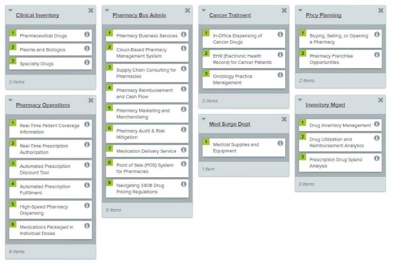
- Spreadsheet of the new categoriesshowing every page, organized by proposed categories, vetted with stakeholders
- SEO validated naming (anchor text) for every page. This appears in the menu navigation, bread crumbs, and cross-links from other pages. The final pass on this was a five hour phone call between me and the SEO on my team.
- SEO validated URLs. The simplified folder structure combined with much shorter slugs resulted in URLs that are much easier to understand. We looked at search volume, and whether a term was 'known,' to finalize the URL.
- Old URL: https://www.mckesson.com/pharmacies/hospital-and-health-system/inpatient/pharmaceutical-distribution-services/controlled-substance-ordering-system--csos-/
- New URL: https://www.mckesson.com/pharmaceutical-distribution/csos/
- Build and Launch
- 140 product pages moved to a new folder, with a new URL. 301 redirects created.
- New CMS function added, to store the SEO-validated page names, and display them correctly.
- New menu and drop-down items. Development to make the menu system more flexible.
- Cross-links added to related pages.
- Test and Analyze
- User testing validated that the new IA was intuitive to use.
- On-page visitor complaints dropped.
- Organic traffic dipped temporarily, since all the URLs were new.
- Form-fills for one business unit went up 30%.
New IA - Clarity
Now there is a clear visual overview of McKesson's business: "Oh. McKesson is a medical distributor that offers services to the healthcare industry." We had many survey complaints saying,"What does McKesson do?"
The needs-based navigation matches visitor expectations, as we discovered during the card-sort phase. Flatter navigation removes 2 layers of audience-based drill-down before you could see a product page, and you can get to the most important pages right from the megamenu.
New IA - Consistency
A single unique SEO/UX phrase is now used for each page. This means that the menu, breadcrumbs, tabs, and inline links all use the same wording. This helps orient people in the site, as they click from a menu item into the page. This value is stored in the CMS.
The new URLs are short, and relate to the anchor text. The content team created new subcategory pages for "/software" and "/patient-care" to support both wayfinding and marketing. Issues with ungainly long URLs and broken breadcrumb paths are fixed.
e-Commerce Shipping Options Cleanup
For the toy store SAAS e-commerce platform I worked on, "Shipping" was the number-one search term in our Help System site logs, and shipping setup delayed launch for about half our customers. Our company policy was, "Needs More Help Video!" My approach was "Make it Less Baffling!" You don't need a help video for a hammer.
BEFORE: Many bad choices, arbitrary names, and repetitive descriptions.


AFTER: Usable choices clearly explained. Choices and setup on the same screen.
SAAS Shipping Option Consolidation
The mechanism to choose the Shipping Modules was hidden from users, and the "Shipping" menu item didn't actually let you set up your shipping method. In UX, this is called a 'dirty trap,' one of my favorite terms. #dirtytrap
Shipping configuration was under "Store > Shipping Module," but activated in the "Admin > Configuration" panel.


Country and Zone setup were under “Admin.” A new International Shipping system left the legacy "Add Countries and Zones" as dangerous clutter. Countries are more easily added from the list itself.


Let's just put all the shipping options in the Shipping Menu.


