BlueBOLT Remote Power Management


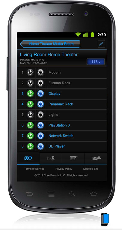
Core Brands (Panamax / Furman) makes internet-enabled power conditioners, and web software (BlueBOLT) to remotely manage them. I designed the software UX and UI for nine new hardware products. I prototyped some more sweeping changes, but the remit was to design UX for new products using the existing UI.
Software/Hardware Product Development
Challenge: To create UX and UI for hardware products, support new platform features, and build on our market lead to out-innovate our competitors. For the first two years at Core Brands my main focus was BlueBOLT UI design. When I took on more complex company-wide customer experience initiatives (B2B Portal design, dynamic price lists, etc.) I was still involved in BlueBolt UX, but it wasn't my main focus.
Role: As the sole UX/UI designer on these new hardware projects, I was also an advocate for the customer on the team. On some projects I was involved in planning the feature set, and on others I was brought in near launch to design the interface.
Process: Gain an understanding of the feature, and the need for it, by talking with customers, product management, engineering, and (especially) tech support. I was an active user of the system, and talked regularly with others about it. I designed simpler user flows, focusing on the main tasks, and minimizing unnecessary decsions or details.
Outcome: I was able to consistently present technical complexity simply and intuitively, in a visually pleasing way. We successfully launched nine new hardware devices, which were well received. I learned the importance of talking with customers, and having a UX voice at the outset of a project, instead of at the end.
I introduced strong UI improvements that fit with the existing visual style.
- Added consistent information across devices and pages (Name, Device, MAC, IP, etc).
- Allowed for per-outlet names. The legacy design only allowed one name for a bank of two outlets.
- Redesigned the outlet layout in an easier to read and understand list form.
- Legacy UI had a grid of outlets, which was incongruent with the physical device.
- The list looked cleaner, was easier to read, and allowed for longer names.
- Provided a better mental model of the physical outlet layout.
- Incorporated semi-skeumorphic Voltmeters, tying the interface design back to the hardware design.
- Designed clearer Admin and Setup pages that were easier to use.
- Changed the display of "Number of Devices" and "Number Offline" to be easily read at a glance.
- Designed an app-style firmware update notification that was hard to overlook.
- Created new icons and buttons, and cleaned up the old ones.
- Invented a system of anthropomorphic outlet faces to show state and connection loss.
Hardware/Software UI
My first Core Brands projects were designing for the ZigBee and Contractor projects, and I was deeply involved in the end-to-end design process. The teams were restructured when we moved buildings, and my main focus became the Core Brands B2B e-commerce portal. I still designed the hardware UI for new products, but as more of a tactical consultant, on loan from the Business Ops team.
- ZigBee wireless mesh-connected outlets, a more consumer offering, a suite consisting of the BBZB-1 Gateway, MD2-ZB outlets with surge protection, and the simpler SP-1000 outlet
- "Contractor Units" connected to BlueBOLT by the BB-RS232 adaptor, consisting of 15 and 20 amp rack-mount and portable power sequencers.
- SM3-PRO, which has modular sensor inputs that can control outlet states.
- M4000-PRO, a rack-mount power conditioner.
- VT4315-PRO, a vertical strip that mounts behind an equipment rack.
- M4315-PRO and F1500-UPS, the earliest BlueBOLT devices, and still the best sellers.


New features required new UI solutions
The M4000-PRO is the first device with a single switch controlling outlets on the front and back of a device. I grouped them visually, and labeled each outlet.


New Admin Panel
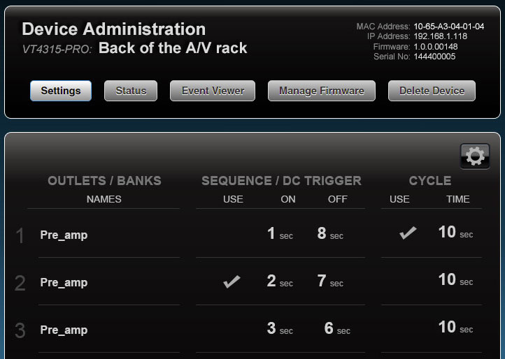
The new Admin panels were easier to read at a glance; hitting the "Edit" gear turns these labels and numbers into editable inputs.
I created a UX requirement and UI layout that each screen relating to a device shows its identification info: MAC address, IP address, and firmware version. This makes it simple to trouble-shoot issues with Tech Support.

Contractor Series
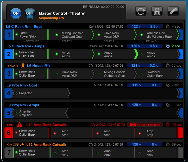
The "Contractor Series" devices are designed to power up their outlets in sequence, and can be wired together in a chain. Power sequencing prevents damage to connected A/V equipment like DSPs and powered speakers. One switch safely powers up the whole venue.
Initial designs and prototypes let customers set outlet delays in software and create "Rehearsal" and "Performance" scenes with different sets of devices, but those features were dropped in development.

Customer Needs
When designing the software UI for the Contractor Series, I looked at how the hardware was being used in very large installations, smaller installs, and dug into its feature set with the firmware and hardware engineers. Product Management and Sales had done the user research, and created the initial spec that I was designing to.
The hardware was used in auditoriums and large churches to safely sequence up a series of amplifiers, DSPs (Digital Signal Processors), and powered monitor speakers across a large hall. The software lets the manager power up the whole hall from anywhere, and watch the sequence unfold. It also shows issues with any device, and allows per-outlet control to shut any equipment down if needed.
- Hardware states: Master key switch to On, Off, or Remote; Delay time settings from the DIP switches.
- Sequence states: Sequencing On or Off, individual delays total sequence time.
- Power Condition: Amps being drawn, incoming Voltage, "Emergency Voltage Shutdown," etc.


Early Prototypes
I designed the user flows for two Contractor Series features that were dropped in development. "SmartSequences" let customers override the hardware sequencing delays from software.


"Custom Scenes." This was a way to visualize an early spec requirement that the software could configure custom sequences, depending on application.


This image shows an earlier color scheme and layout, as well as the full sequence. Final design was simplified, but showed more information for each device.


Redesign of legacy UI
The original BlueBOLT UI only allowed single labels for banks with two outlets, the outlets were arranged in an unintuitive grid, and the volts and amps were shown with dials, which didn't relate to the physical hardware. Buttons are stacked, where all new UI has them side-by-side.
Old Design
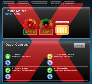

In order to align the design language across all our products, and make the customer experience more seamless, I went back to the original M4315-PRO and F1500 BlueBOLT devices, and incorporated advancements from the ZigBee-networked devices. These flagship units are still the best sellers, with tens of thousands of units in the field, so modernizing them benefits many customers, and renews their relevance.
Labels, voltmeters, and battery backup indicators are updated, and the "renaming" settings are inline, instead of on a separate screen.
Updated Design


UI Matches the Physical Hardware
The new visual user interface takes its cues from the industrial design of the physical hardware. I wanted people to feel like they were in the same world, whether looking at the unit in the equipment rack, or logging into the application.


