Archives for May 2012

May 29, 2012 - Comments Off on Black Twig Media

Black Twig Media

I took a few liberties with the way a redwing blackbird wing actually looks, since I wanted the overall feel to be more like the bird itself. I tweaked the capitals a bit, especially the "T."

May 26, 2012 - Comments Off on DTS Overland logo and door graphic

DTS Overland logo and door graphic

DTS Overland is a backcountry tour company in Bend, OR. DTS Overland Tours and Adventures, LLC.

I drew each element on a separate sheet of paper for ease of layout in the computer. It's all vectorized in Illustrator and laid out in Photoshop. The door graphic will go on coyote tan Land Cruisers, and the main logo (with the FJ80) will go on everything else: tee shirts, flyers, and children (if they stand still long enough).

May 14, 2012 - Comments Off on Mobile Shopping Template

Mobile Shopping Template

We are designing and building a mobile template for our ~200 toy store clients. There are some constraints to making it fit in an existing system, but also advantages.

This is the gray version, but the front-end developer built the system with the "less" CSS preprocessor, so he can control the color palette and button corner radius by changing a couple numbers. This will let us offer optional customizing for the members that want the mobile site to complement their main site better.

Home Page

Important info for mobile visitors: location, phone and hours. Content displays in a "drawer" below that level of icons. This is all HTML and CSS, but styled to look like an app.

20120514-092502.jpg

Browse Page

The shopping pages have smaller store info buttons (hours, location, phone). The logo pane shrinks to allow room for the 'cart checkout' button and cart summary at the top of the screen.

20120514-092523.jpg

Product Details

Multiple thumbnails display, and can be tapped or dragged to change. When you hit "Add To Cart," the button changes to "Checkout Now," and the drawer opens so you can change quantity. (This is the state shown) The cart summary updates in real time when you change the quantity.

20120514-092536.jpg

Prototype on the iPhone

The interface is running and working, but the actual content isn't hooked up yet.

20120514-092552.jpg

May 9, 2012 - Comments Off on Toy Phone Icon

Toy Phone Icon

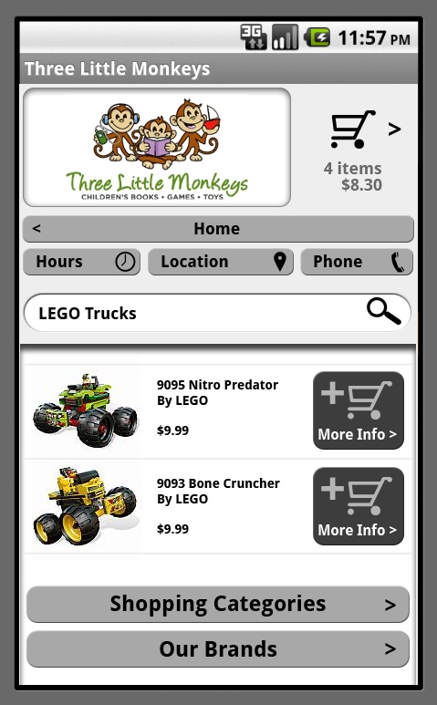
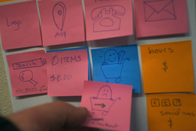
For the mobile templates we're building, I tried out some 'toy store' specific icons, but generic ones made more sense for the budget and timeframe.

Vector illustration in Photoshop. The face is done with layer effects to get the 'inset' look. It helps the face read better at tiny sizes, too.

May 2, 2012 - Comments Off on Mobile “Toy Filter” UI Design process

Mobile “Toy Filter” UI Design process

I know I'm not the only one who does UI design this way:

  • Sticky notes.
  • A white board.
  • A programmer.

I draw the UI bits on sticky notes, we discuss the needs and potential problems, and move the sticky notes around on a board.

something's added to the cart!

Below is our existing "Toy Filter" laid out for the new mobile template for our e-commerce toy store system. It's a reskinning of existing code, with no new features (a requirement of getting the mobile site built and pushed to 200+ sites quickly). At the top is the 'Search' icon; Shopper's 'Cart' contents (number of products and dollar amount); 'Checkout' icon.

drop-down filter for mobile e-com toy search

When you tap the Search icon, a search box slides out, with options to refine your search and display the results. I think it's more usable than the layout we have on the desktop sites (which I didn't design).

  • Search Box
  • Filter by: Category, Brand, Price
  • Sort by: (Name, Price, etc)
  • FIND TOYS button.

We ended up with four pages with sticky notes laid out, one each for the Homepage, category Browse Page, Product Details page, and Checkout. I asked the programmer if he wanted me to mock them up in Balsamiq, and he said, "No, I've got it all right here."