All Posts in UX/UI

August 18, 2016 - Comments Off on Auriel Multi-System Home Control

Auriel Multi-System Home Control

Multi-system management for the Niles Auriel multi-room audio app.
Built for simplicity, security, and automated login.
auriel-secure1

This feature simplifies the ability to connect to multiple systems. Instead of forcing the user to navigate to a "remote" or "local" system, the app simply finds all saved systems. We added a passcode feature, enabled per system. Fully responsive, all elements lay out correctly on phones, tablets, and in the desktop viewer.

Tapping the gear icons slides out "Security" and "Add" buttons out, and activates "Edit."

August 17, 2016 - Comments Off on BlueBOLT remote power management

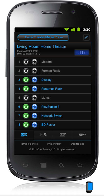
BlueBOLT remote power management

bluebolt-mobile1

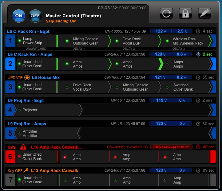
Panamax and Furman power conditioners can be controlled remotely, and programmed to reboot routers, report power conditions, and power-cycle racks of connected equipment. "Contractor" units can control a chain of multiple sequencers.

contractor-2

Any new UI had to fit into the existing visual framework, but I did introduce multi-line outlet names, cute powered outlet faces, and meters to replace the dials used for older products. The meters echo the ID of the hardware, and are easier to draw.

New devices have new features and configurations, needing new UI and UX solutions. One switch controls three outlets, one of which is on the front of the unit. We devised a new way of grouping outlets visually, and labeled the location.

m4000pro-banks1

UI realignment and battery drain icon for F1500-PRO. 

f1500-redesign1

Consistent Device info across all screens (Name, Device, MAC, IP, etc)
Device Admin settings (sequence delays, etc).

bluebolt-vt4315pro-admin3

August 16, 2016 - Comments Off on Core Brands B2B Portal

Core Brands B2B Portal

$100M company becomes an e-commerce company.

store-cart-open

Until my team launched the B2B Portal last year, Core Brands customers and reps would email, phone, or fax their orders in. Now, well over half the targeted customer segment orders through the Portal.

Designed and mocked up the initial high fidelity design.

  • Walk-throughs were used to refine the microinteractions.
  • Mockups illustrated each feature in the spec document.

I designed new features, which were developed in sprints by the remote team.
- Customer Account - See terms, brands, accrued rebates, etc.
- Compare - you can directly compare up to three products.
- Quick Pad - you can paste an order right into the Cart.
- Customer Types - Each sales channel sees a customized homepage.
- Employee Purchase Program - 9,500 Nortek employees can now shop on the Portal.

"Compare" feature shows all features and specs for chosen products:
compare-dropdown_search-maybe

"Compare" micro-interaction when adding more than 3 products:
compare-remove-02

Responsive design; different layouts at different breakpoints:
store-employee-top-mobile

August 14, 2016 - Comments Off on Pricelist Redesign

Pricelist Redesign

The new price lists are automated and accurate, saving hours of time for Core Brands staff and for our customers. Automating the lists gave the Marketing Director 60% more time to spend on marketing, instead of price lists.

New Pricelists

The old price lists were hand-rolled Excel files, often six months or more out of date. The lists showed product by SKU, with an arbitrary "Level" pricing.

The new price lists are customer-first. Each customer sees their exact price, not an approximation, and only items they can buy. New price lists include customer info and date, reinforcing the custom nature of the list.

Customers can generate a new price list any time they like. Each type of list has appropriate info and layout: PDF, CSV, International, MSRP, Price Policy.

August 13, 2016 - Comments Off on Invoice Redesign

Invoice Redesign

Existing invoices were a mishmash of legacy forms.

invoice-xxxCore Brands' forms and invoices had come from different systems, and were legacies of the original several companies. The invoices were hard to read, and were missing key pieces of information, which led to costs - customer calls, hand-filing bad forms.

The new forms can be read by humans. Branding is now consistent, and the layout is consistent. All forms have the important elements in the top right corner. Each field in the template pulls data automatically from the order field in Netsuite.

A new design for all transaction forms.

This project covered all outgoing forms: Invoices, Pro Forma Invoices for international customers, Sales Order Acknowledgements, Shipping Confirmations, Credit Memos, Cash Sales, Return Authorizations.

June 28, 2012 - Comments Off on A good UI designer is lazy and stupid

A good UI designer is lazy and stupid

A headhunter asked me "why do you think you're a good UI designer?"

Instead of saying, "because I've spent a dozen years constantly figuring out how to make complicated software accessible to normal people," I said what I really thought: "I'm a good UI designer because I'm lazy and stupid, and will rage-quit anything that isn't easier than cracking open a beer."

Hmm. Discretion might well be the better part of valor.

May 2, 2012 - Comments Off on Mobile “Toy Filter” UI Design process

Mobile “Toy Filter” UI Design process

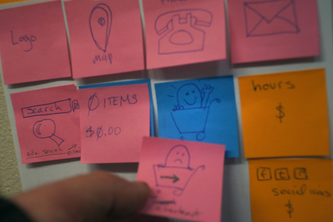
I know I'm not the only one who does UI design this way:

  • Sticky notes.
  • A white board.
  • A programmer.

I draw the UI bits on sticky notes, we discuss the needs and potential problems, and move the sticky notes around on a board.

something's added to the cart!

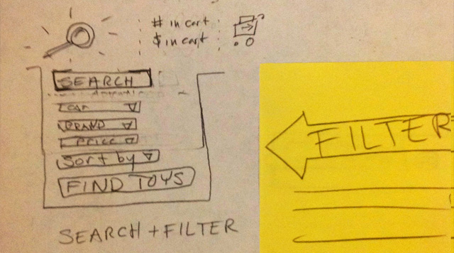
Below is our existing "Toy Filter" laid out for the new mobile template for our e-commerce toy store system. It's a reskinning of existing code, with no new features (a requirement of getting the mobile site built and pushed to 200+ sites quickly). At the top is the 'Search' icon; Shopper's 'Cart' contents (number of products and dollar amount); 'Checkout' icon.

drop-down filter for mobile e-com toy search

When you tap the Search icon, a search box slides out, with options to refine your search and display the results. I think it's more usable than the layout we have on the desktop sites (which I didn't design).

  • Search Box
  • Filter by: Category, Brand, Price
  • Sort by: (Name, Price, etc)
  • FIND TOYS button.

We ended up with four pages with sticky notes laid out, one each for the Homepage, category Browse Page, Product Details page, and Checkout. I asked the programmer if he wanted me to mock them up in Balsamiq, and he said, "No, I've got it all right here."


April 28, 2012 - Comments Off on Tire Pressure Widget

Tire Pressure Widget

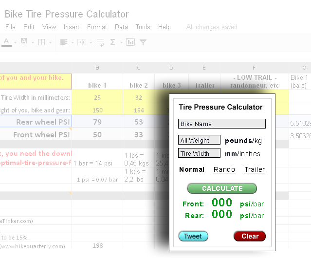
On my Bike Tinker blog, I have a Google Doc for calculating optimal tire pressure.  This is the web widget I designed to replace that. It is much easier to use, and I won't have to maintain it at all.

Tire Pressure widget is so much more manageable than the Google Doc

It gets a fair amount of traffic, and people often delete or damage the functions. Some people add features, like "trailers," or "kg/bar" conversions, which is cool, but managing the document is tedious, and usability could be better. If usability was optimal, then people wouldn't break it, right?

The next step will be a mobile app that allows for saving multiple bikes. Maybe it can talk to Cyclemeter to show performance changes at different pressures...

April 13, 2012 - Comments Off on MFG DB Status List

MFG DB Status List

The company I work for provides a SAAS e-commerce web system to the toy industry.

This is my initial mock-up of the "thick" view of a tool to show our members and manufacturing partners the status of every toy brand in our Import Database*. There will be a "thin" view, with one row per manufacturer, and an "Open" view as well, that shows all manufacturer-provided info.

The "Request" button helps us prioritize the processing, there are hooks for direct marketing from manufacturers to retailers, and a link to the relationship-building product we have in development.

Upload date, most recent year of release, request button


*We pre-process toy data so our members can Import the products into their sites with a click. We are building a tool to clearly show which lines are up-to-date, and allow our subscribers to "Request" an update to a line. With the number of manufacturers, and the volume of data we get, we prioritize on what our members need. The lines with the most requests go into the processing queue first.

March 2, 2012 - Comments Off on Shipping Options setup

Shipping Options setup

"Shipping" was the number-one search term in our Help System.  Our e-commerce Shipping Options had been built upon for years, with no consistent design. Valuable new features were hidden among deprecated options, their natures obscured with ad hoc names and descriptions. As part of our Shipping cleanup, we redid the setup options.

Old Shipping Module List marked up for revision

This is the graphic I gave the developers, showing exactly what gets changed, along with new names and descriptions.

  • The red columns are not useful to our clients, and are slated for removal.
  • The green boxes show the new ordering. The new menu layout makes it clear.
  • The bubbles in the middle show the new, names and descriptions.

New Shipping Module List

Everything is simplified, and reordered for clarity. This will be wrapped in a tabbed interface that covers all shipping options (no more drop-down menus).

  • Unused modules and useless columns are removed
  • The “Enabled” icons become checkboxes, and the names now link directly to the configuration settings
  • Modules are grouped by similarity, from most to least used.

Frankly, "Custom" should go, and "Flex" and "ShipValue" might be better with descriptive names...

February 2, 2012 - Comments Off on Shipping Menu Cleanup

Shipping Menu Cleanup

Our e-commerce system was built on the Joomla CMS, and extended over several years, with added features fragmented over several menus and configuration panels. We are extending it, but can't rip it down and build from scratch, since 200 sites are using it for their businesses.

"Shipping" was by far the most-searched keyword in the Help System. First, I made the Shipping Help more findable, and then tackled the underlying problem - poor usability in the Shipping tools themselves. I consolidated the scattered, cluttered Shipping setup options into a single, self-explanatory menu.

Old Shipping Settings scattered over three menus

The "Shipping Menu" itself only had bad choices: four options, all to set up a deprecated shipping system that no one used.

Countries and Zones for shipping and selling to were under “Admin”

Some redundancies had been created during development of the International Shipping system, and never removed. The option to add countries and zones from the menu was dangerous clutter, since the pre-populated list of countries is exhaustive, and you can add a new country from the list itself, if needed.

The list of active and available Shipping Modules was under “Store”

Each module's settings (price breaks, etc) could be configured from the Shipping Module List, but they couldn't be activated. To do that, you needed to go to the "Admin > Configuration" panel!

New Consolidated Shipping Menu

All that fragmentation of function was re-presented in this short menu of four items. Everything under one roof, fewer bad options. Frankly, I'd drop "Custom Shippers" too, but I was outvoted by code-hoarders.

The Shipping Module List itself was also reorganized for clarity, with unused choices deleted and supported modules renamed.

December 31, 2011 - Comments Off on Registrars and host servers

Registrars and host servers

Non-technical people may not know that their domain name is separate from their hosting. This is a little diagram for those people.

How will people find me? (You might ask)


July 18, 2011 - Comments Off on Toy Data Editor Window

Toy Data Editor Window

This is the Editor window for more control over products than the Inline Editor gives you.

This Editor Window overlays the Inline Editor in a lightbox when you choose an item to edit. You can add images, HTML descriptions, fine-tune pricing and discounts, age ranges, shipping over-rides and assign related products.

The help page is organized around giving people the Least They Need to Know, supported by Advanced explanations of each element and area. That way there's one page as a reference, no one is sorted into newb/expert user, and people get the idea it's an approachable process.

Basic Editor functions - large image

I have a cleaned-up layout ready to go, but implementation is queued behind locking down the new shared images, and moving all our clients to Cloudsites. Awesome technology courtesy of Kristopher Ives and Lucas Green.

June 18, 2011 - Comments Off on Database import tool

Database import tool

This tool presents the pre-processed product information we provide our members in a sortable, filterable way.

One click will bring a product into their site.

Toy data Import Tool - larger image

Newest items are at the top, which shows our clients that we've been busy on their behalf.

Columns to sort and filter by:

  •     Date (sort by Date, filter by Year) - The Importer is sorted by date by default, so you see the newest added products at the top.
  •     SKU (mfg prefix, + item number) - Filter by partial SKUs to get a range ("dj" in SKU and "Hotaling" in Brand shows all Djeco products).
  •     Product Name - Filter by partial name to see similar items. "Smen" in Product Name shows Smencils and Smens Pens, for example.
  •     Brand - Sort or Filter by manufacturer name.
  •     Category - Categories can be "mapped" to local site category names with the Import Mapping tool.
  •     UPC / ISBN / EAN (all in the same filter box) - UPC is the most common, ISBN is books, EAN is euro-UPC.

Kristopher Ives made this version of the Import Tool, based on his Inline Product Editor, Don Hays is the reason there's any data to import, and I made the help pages.


August 21, 2010 - Comments Off on Demo Disc interfaces

Demo Disc interfaces
kiosk 2.6