May 2, 2012 - Comments Off on Mobile “Toy Filter” UI Design process
Mobile “Toy Filter” UI Design process
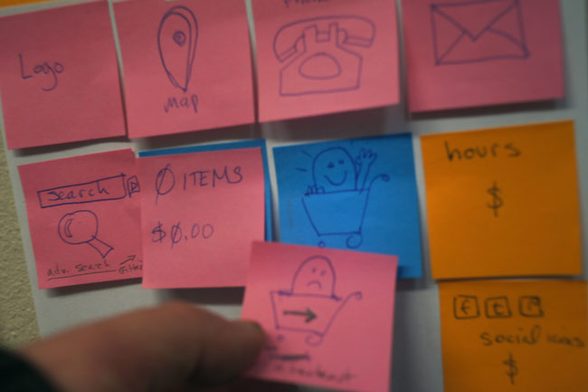
I know I'm not the only one who does UI design this way:
- Sticky notes.
- A white board.
- A programmer.
I draw the UI bits on sticky notes, we discuss the needs and potential problems, and move the sticky notes around on a board.
Below is our existing "Toy Filter" laid out for the new mobile template for our e-commerce toy store system. It's a reskinning of existing code, with no new features (a requirement of getting the mobile site built and pushed to 200+ sites quickly). At the top is the 'Search' icon; Shopper's 'Cart' contents (number of products and dollar amount); 'Checkout' icon.

When you tap the Search icon, a search box slides out, with options to refine your search and display the results. I think it's more usable than the layout we have on the desktop sites (which I didn't design).
- Search Box
- Filter by: Category, Brand, Price
- Sort by: (Name, Price, etc)
- FIND TOYS button.
We ended up with four pages with sticky notes laid out, one each for the Homepage, category Browse Page, Product Details page, and Checkout. I asked the programmer if he wanted me to mock them up in Balsamiq, and he said, "No, I've got it all right here."
Comments are closed.