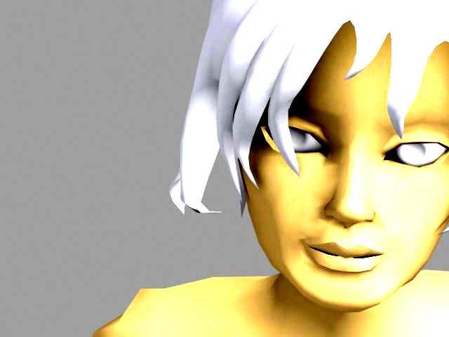
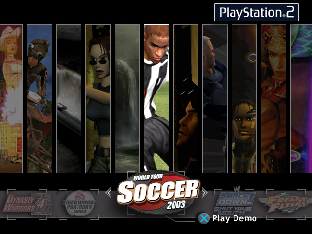
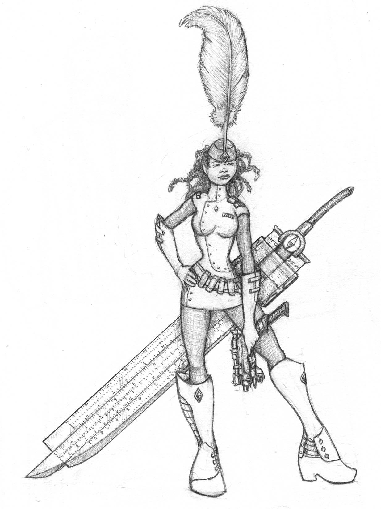
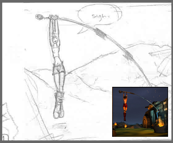
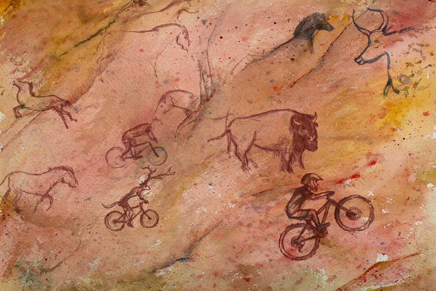
October 20, 2010 - Comments Off on Maya – comic heroine

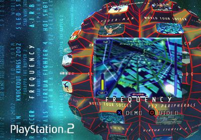
I developed this character, which was used for a demo of an interactive comic for the PlayStation2. I plotted the comic, designed the characters and drew the storyboards.
More art from this project here: PS2 Interactive Comic.
It was a pretty cool project, using 3D scenes in the PlayStation2 to tell a comic story. There were pages and panels, effects and animation. "Choose your own adventure" choices threaded through the story.
The Plot
The story opens with a young woman, Maya, making her way across the still-hot scene of a futuristic battlefield. She has, until recently, been a privileged engineering student at the elite technical college that was the focus of the short-lived war.
While stripping parts from a personnel carrier, she is attacked by a suit of mechanized armor. The body within is dead, but the combat programming will attack anything that moves. With the help of a "Spirit Cat," a holographic blue animal guide, she defeats the armor. After removing the mummified corpse inside, she repairs it for her own use.
She can now cover more ground and protect herself from the broken war machines she encounters. The spirit cat disappears, in the way that they do.
She repairs the suit's long-range sensors and communication gear, and picks up distress signals from the mountains around the plain. A young soldier, about her age, has been badly wounded in an attack on his base. He can't move far, and has bouts of confusion and disorientation. His situation gives her a destination, and his base is stocked with food and water, with defenses that might be repairable.
Maya starts to bond with this him, as she makes her way towards his position. Right after they admit to really liking each other, she's attacked, and his base comes under fire. She can hear heavy guns on his end, and communication is cut off. She hurries on, desperate.
She reaches the base at the narrow end of a steep wooded valley. It's empty, though, with no sign of her soldier, and it appears abandoned rather than overrun. As she's standing in the empty base, she receives communication contact from her injured soldier again. He admits he tricked her.
He isn't really a soldier, and he was only at the base briefly, a few weeks before. He is, in fact, the artificial combat intelligence built into her own suit. He's been right next to her the whole time, and he isn't even human. She freaks out.
She disables the suit, strips it off in a panic, and locks it behind the hardened blast doors of the abandoned base. She sits the concrete landing apron in front of the bunker, as far from the suit as she can get. Looking over the valley to the plain she just fought her way across, she trys to make sense of the last week of her life. What was a lie? What was real?
She doesn't hear the suit's sirens trying to warn her as large airships move silently up the valley to capture her...


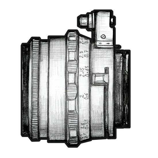
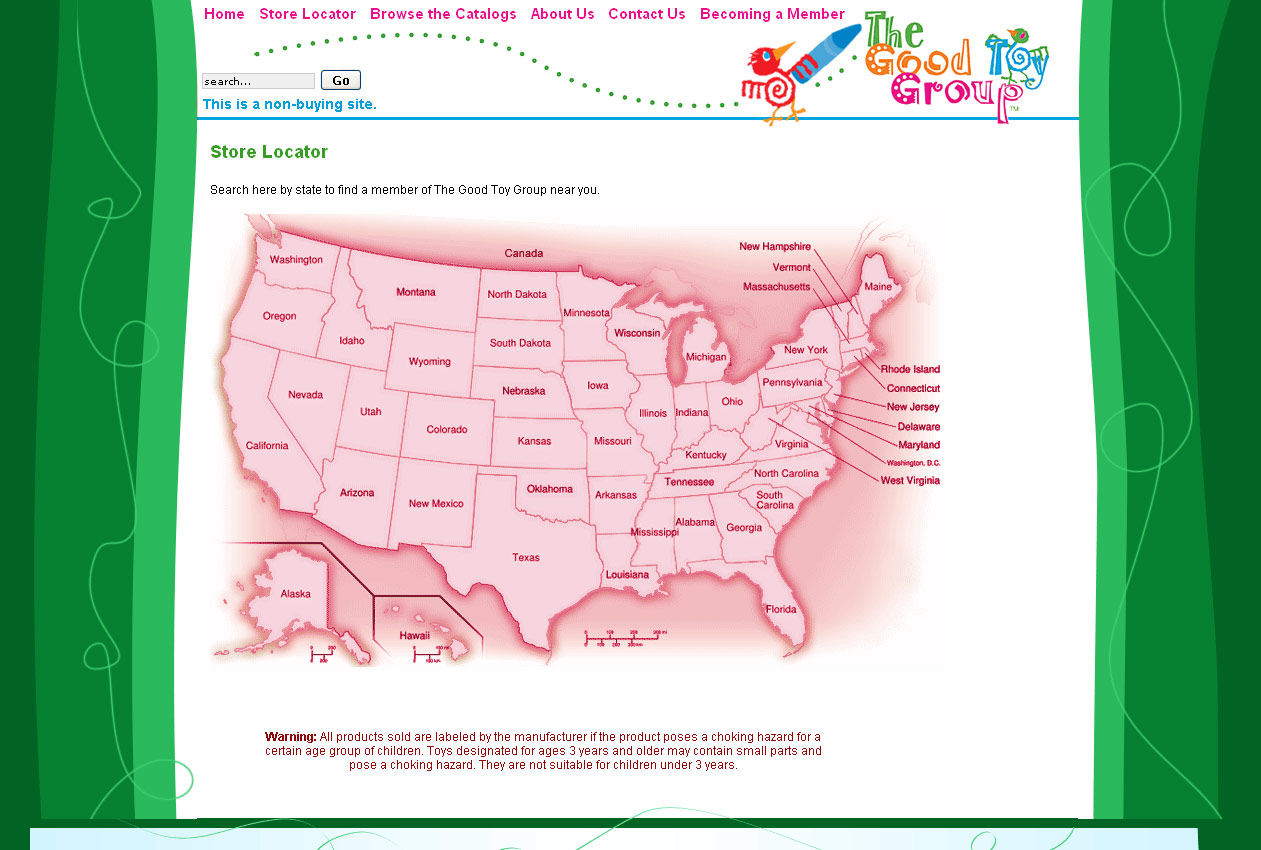
 For the mobile templates we're building, I tried out some 'toy store' specific icons, but generic ones made more sense for the budget and timeframe.


